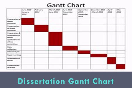
You have searched every corner of Microsoft excel but can’t find a Gantt chart option? Wondering if you are missing something?
NOTE: There is no such option as the Gantt chart in Microsoft excel but it is fairly easy to create one. By following these steps you can easily create a dissertation Gantt chart in no more than 60 minutes.
How to Create a Dissertation Grant Chart in Microsoft Excel 2007?
First step:
Start a new workbook and enter your data as shown in the figure below.
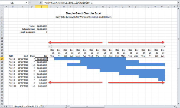
The first column that is column A would contain the task description, column B, the start date, C the number of days to complete a task and D will show the formulas that will determine the completion of a particular task. For instance, to calculate D2, the formula will be B2 + C2 – 1. Here, column D isn’t important but including it will tell you the exact date of the completion of a task.
Second step:
Make a stacked bar chart from the data having a range of A2: C13. The chart wizard will take out the incorrect answers; therefore, you will have to set out the category axis labels and data series on your own. The x-axis labels should have a range of A2: A13, the series 1 data must be in B2: B13 and the series 2 data must be in the range of C2: C13.
Third step:
Delete the chart’s legend and adjust the chart’s height as required. It is advisable to change the fonts to a smaller size so as to show the x-axis labels.
Fourth step:
In the dialog box of format axis, select “categories in reverse order” and for the y-axis, “cross at maximum category”. This will display the task in order from top to bottom.
Fifth step:
Open the dialogue box to format the y-axis. Input the max and min values to correspond to the latest and earliest dates of your project. Make sure you have entered real dates. Now for the weekly intervals, set the min to Monday and max to Sunday while the major unit to seven.
Sixth step:
opt for the data series that co-relates to the data mentioned in column B and go for the format data series dialogue box. Set the border and area to none. This will hide the first data series that are the starting dates that will make the chart looks like a Gantt chart.
Seventh step:
Just like this, apply another formatting as desired. For example, to make it look good, you can add gridlines and an intriguing title.
Thus by following the easy effective steps done down in pen above would help to construct the best Dissertation Gantt’s chart on Micro soft Excel.
Paid Topic Mini Proposal (500 Words)
You will get the topics first and then the mini proposal which includes:
- An explanation why we choose this topic.
- 2-3 research questions.
- Key literature resources identification.
- Suitable methodology including raw sample size and data collection method
- View a Sample of Service